设计概念 | Design Concept
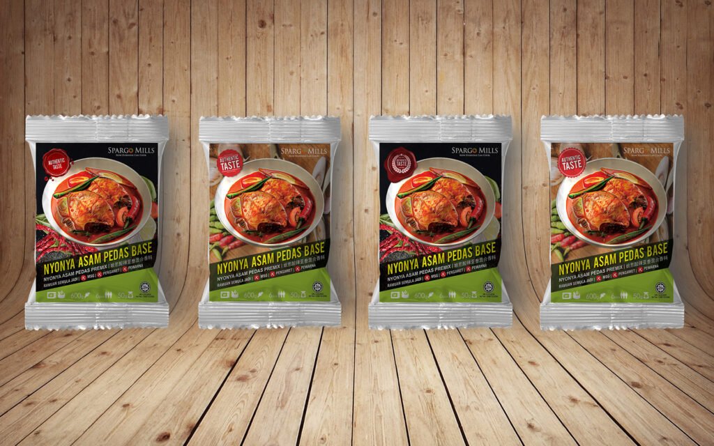
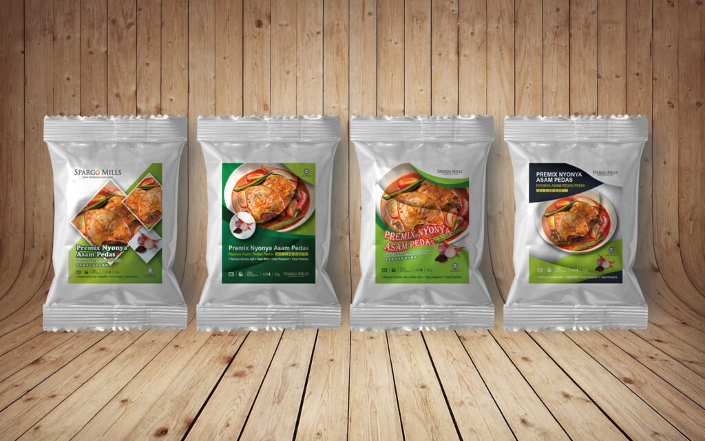
本包装设计旨在展现 Nyonya Asam Pedas 的正宗风味,同时增强产品的市场吸引力。包装正面采用高质量美食摄影,突显产品的美味,并搭配红色、绿色和黑色的配色方案,象征着香辣、天然和高端品质。
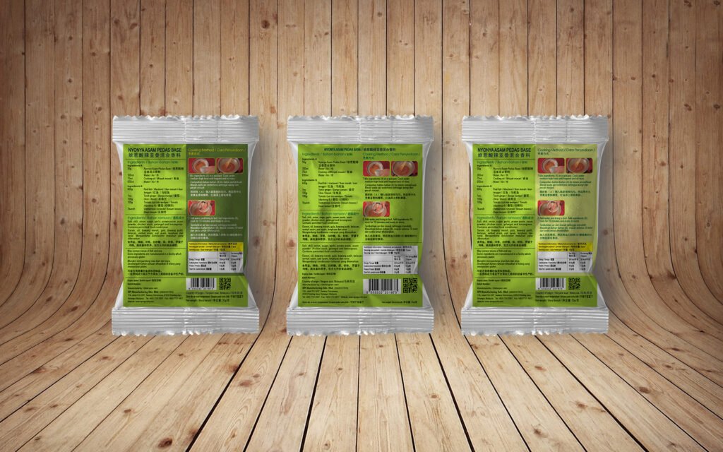
背面设计则注重清晰的信息展示,包括成分、烹饪方法和营养信息,以确保消费者能够快速获取产品的使用方式和营养价值。整体设计现代、简洁,同时保持传统风味的视觉元素,以迎合现代消费者的需求。
The packaging design aims to showcase the authentic flavor of Nyonya Asam Pedas while enhancing the product’s market appeal. The front side features high-quality food photography that highlights the deliciousness of the dish, complemented by a color scheme of red, green, and black, symbolizing spiciness, natural ingredients, and premium quality.
The back design focuses on clear information display, including ingredients, cooking methods, and nutritional details, ensuring that consumers can quickly understand the product’s usage and benefits. The overall design is modern and clean while retaining traditional visual elements to appeal to contemporary consumers.
设计要点 | Key Design Elements
1. 美食摄影 | Food Photography
- 采用高清真实的 Asam Pedas 菜肴图片,增加视觉吸引力,让消费者一目了然地理解产品的用途。
- High-resolution, realistic images of Asam Pedas dishes enhance visual appeal, helping consumers quickly understand the product’s use.
2. 品牌标识 | Branding
- “SPARGO MILLS” 品牌名称突出,搭配“Authentic Taste” 标志,强调传统和正宗风味。
- The “SPARGO MILLS” brand name is prominently displayed alongside the “Authentic Taste” label, emphasizing tradition and authenticity.
3. 颜色搭配 | Color Scheme
- 红色(Red):象征辣味和热情,吸引消费者注意力。
- 绿色(Green):代表天然成分和健康。
- 黑色(Black):传递高端和专业感。
- Red: Symbolizes spiciness and passion, drawing consumer attention.
- Green: Represents natural ingredients and health.
- Black: Conveys a premium and professional feel.
4. 信息布局 | Information Layout
- 正面 | Front Side:产品名称、关键特点、认证标志(如 Halal 认证)。
- 背面 | Back Side:详细的成分列表、烹饪方法、营养信息和二维码,以增强用户体验。
- Front Side: Product name, key features, and certification labels (e.g., Halal certification).
- Back Side: Detailed ingredient list, cooking instructions, nutritional information, and a QR code for an enhanced user experience.
5. 用户友好 | User-Friendly Design
- 采用清晰易读的字体,使所有信息一目了然,适合不同年龄层的消费者。
- 添加二维码,方便消费者扫描获取更多产品信息或食谱。
- Uses clear, readable fonts to ensure all information is easily accessible for consumers of all ages.
- Includes a QR code for convenient access to additional product information or recipes.


")
")
")
")
")