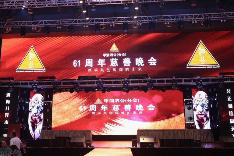
甲洞泗公(分会)周年慈善晚会设计 | 项目概述 Project Overview:
为庆祝甲洞泗公(分会)周年慈善晚会,设计将涵盖四个主要部分:大型电子屏幕视觉、晚会纪念 Coffee Book、现场舞台背景布(Backdrop),以及专属活动网页。所有设计需展现庄重、团结与感恩的主题,同时融入中华传统文化元素,体现泗公公会的精神与历史。
This design project supports the annual charity gala of Kepong Si Gong (Sub-Branch), covering four key areas: LED screen visuals, a commemorative coffee book, stage backdrop design, and a dedicated event website. The creative direction will reflect a theme of solemnity, unity, and gratitude, incorporating traditional Chinese cultural elements to highlight the heritage and values of the Si Gong Association.
设计内容 Design Scope:
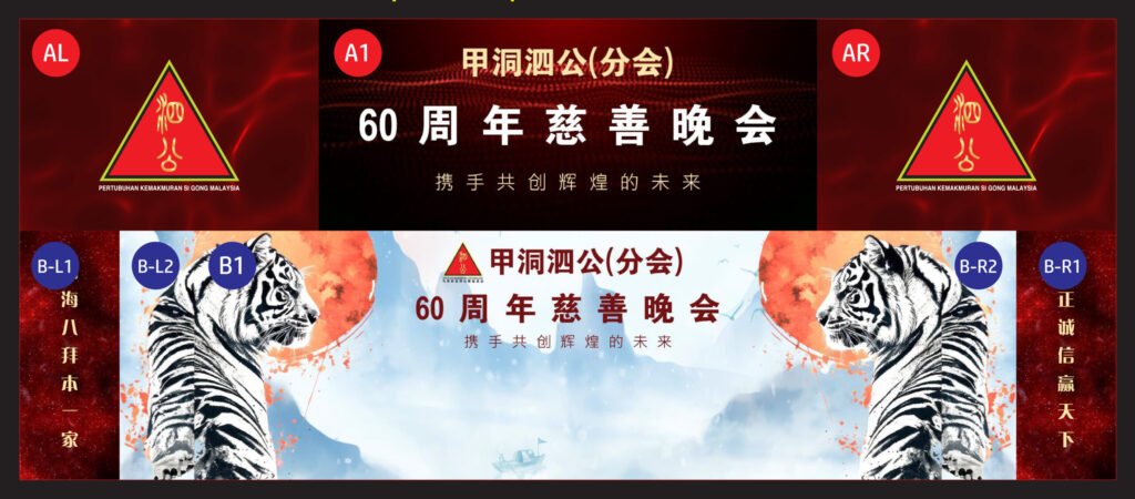
- 电子屏幕视觉 LED Screen Visuals
- 晚会节目流程动态展示
- 嘉宾介绍、致辞背景
- 视频/照片轮播框架
- 色彩风格需统一、视觉节奏有序
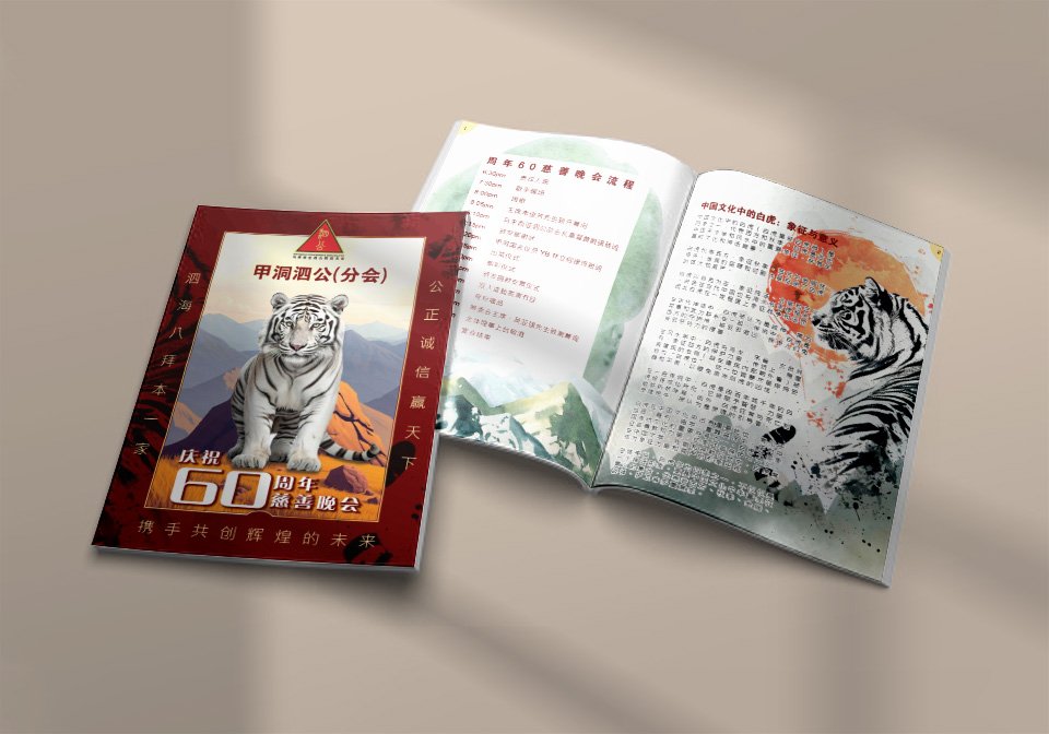
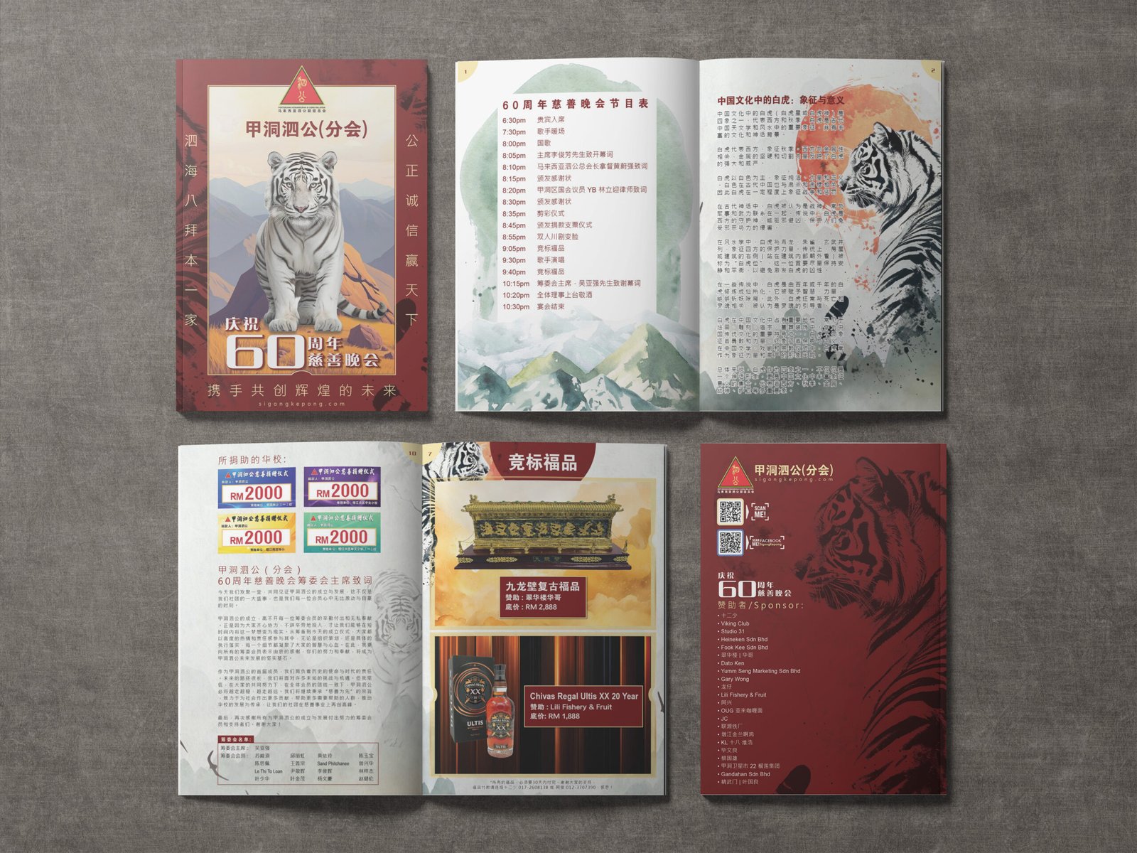
- Coffee Book 纪念册设计
- 内容包括历史回顾、晚会亮点、赞助鸣谢、会员合影等
- 尺寸建议 A4 或方形,图文结合,富有纪念意义
- 封面与内页风格统一、印刷质感高端
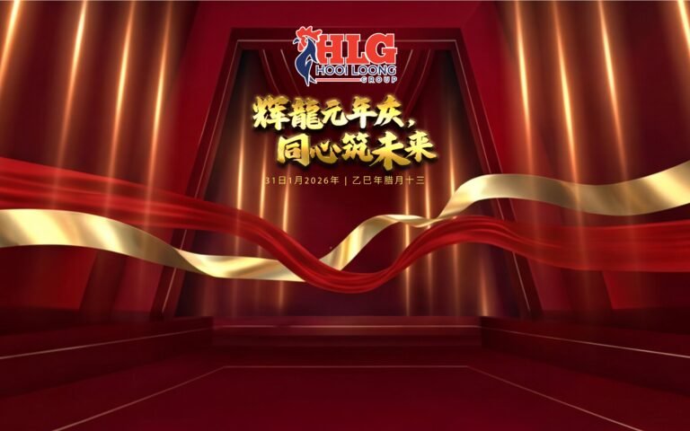
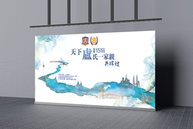
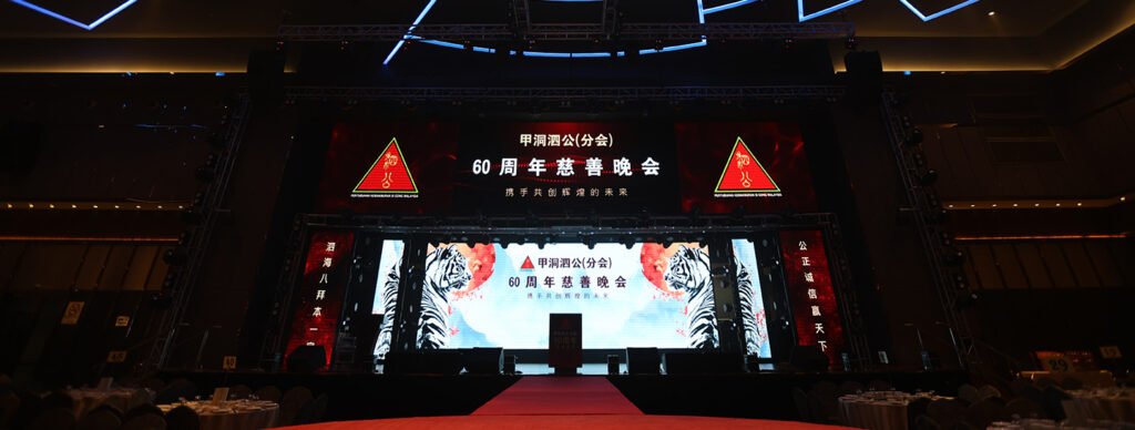
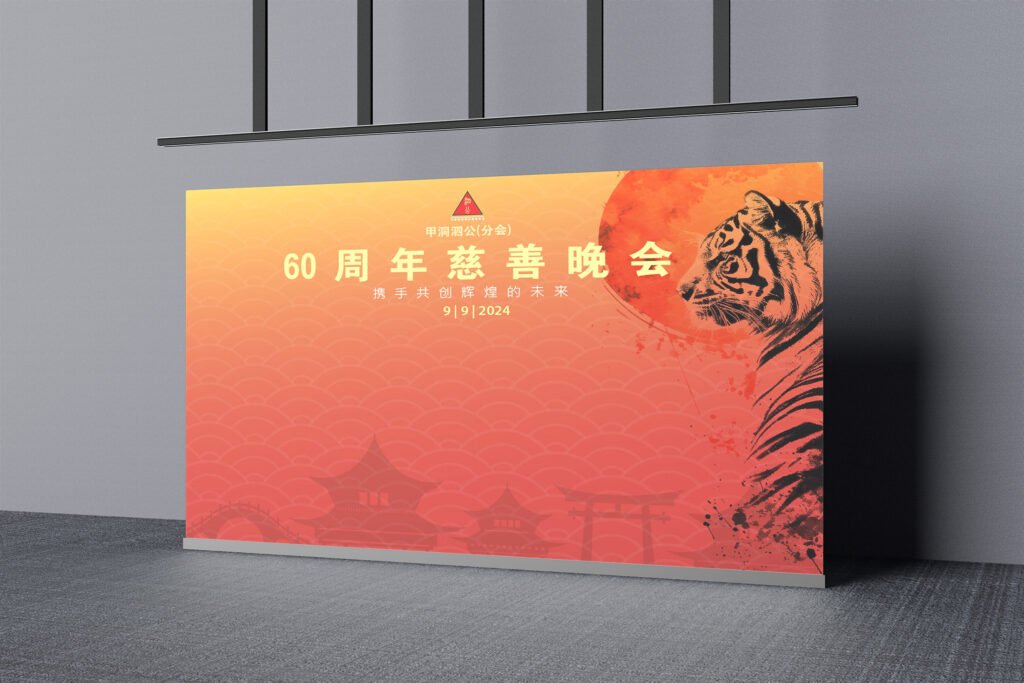
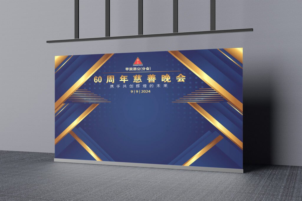
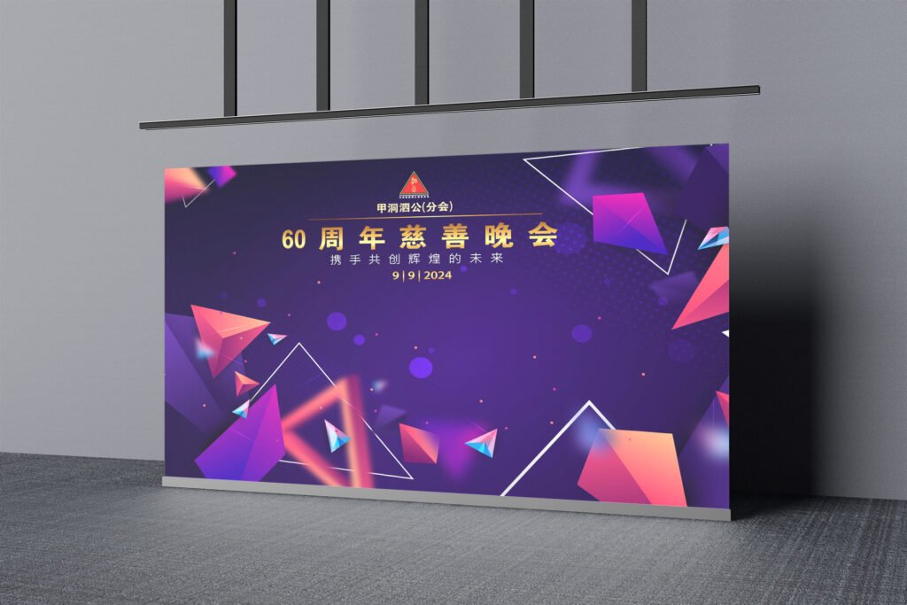
- 舞台背景布 Backdrop Design
- 主背景用于舞台正中,突出晚会主题及标志
- 配色应协调整体场地布置
- 需确保远观视觉效果清晰,近看细节丰富
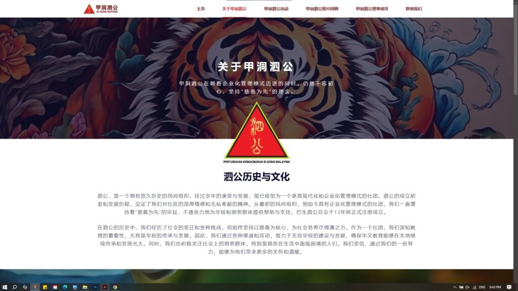
- 网页设计 Event Website Design
- 制作一页式响应式网页,用于活动宣传与资料展示包含晚会简介、时间地点、赞助单位、报名/联络信息、照片画廊等风格需延续实体视觉设计,提升线上互动体验
设计方向 Design Direction:
- 以“传承与感恩”为核心
- 使用传统纹样、水墨元素、红金配色
- 平衡现代感与文化底蕴
Visuals will be centered on the theme of “Heritage and Gratitude,” using traditional motifs, ink-wash elements, and a red-gold palette to combine cultural depth with modern elegance.