本系列包装设计结合传统与现代视觉元素,展现中式甜品的文化底蕴与美味特色。三款设计分别代表不同风格:古风怀旧、清新温润与现代东方,通过色彩、字体与图像的搭配,传递产品的健康、美味与便捷性,提升消费者的视觉吸引力与购买欲望。
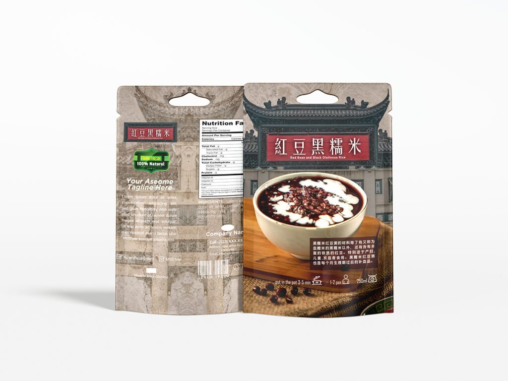
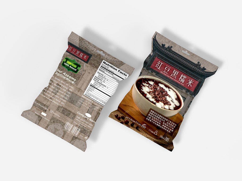
红豆黑糯米 | 古风怀旧风格
设计概念:
结合中国古建筑背景与传统餐具,整体采用怀旧的棕灰色调,传递出古早味和文化厚重感。字体采用仿宋风格,强化传统感,适合强调健康与传统的食品产品。
Design Concept:
Combining Chinese architectural elements with traditional tableware, this design uses nostalgic earthy tones to evoke a sense of cultural heritage. The classic-style typography reinforces its traditional and healthy appeal, ideal for authentic, heritage-based food products.
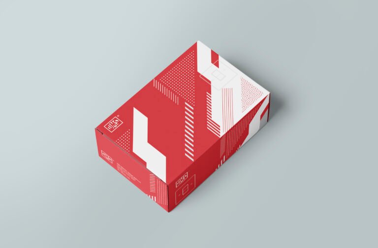
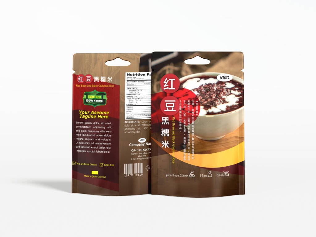
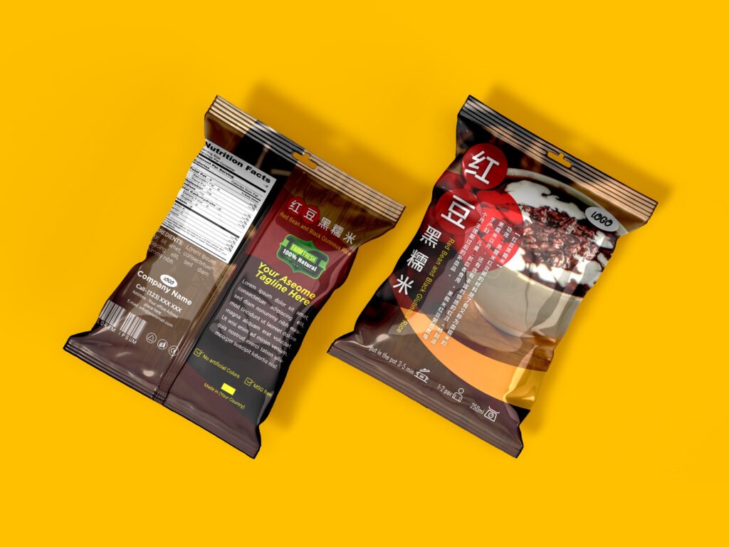
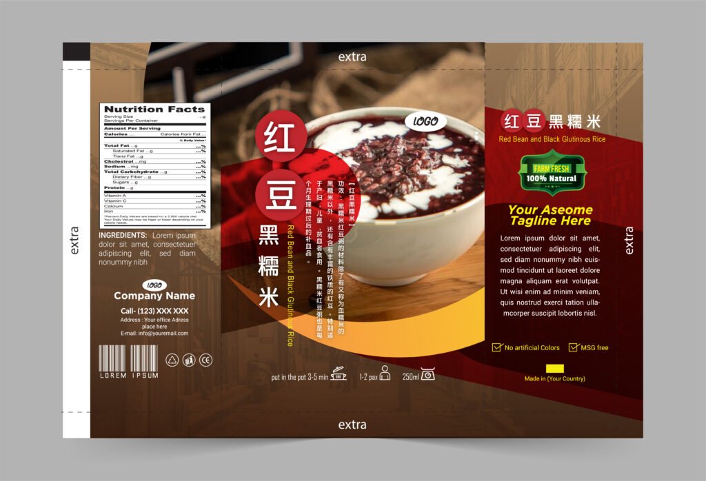
红豆黑糯米 | 现代东方风格
设计概念:
以浓烈的红黑配色展现浓郁口感,辅以现代化排版与圆形文字区块,融合传统与现代的视觉语言。视觉冲击强烈,适合在货架上脱颖而出。
Design Concept:
Using a bold red-and-black color palette, this packaging highlights the product’s rich flavor and texture. The circular text elements and modern layout blend tradition with contemporary visual language, making it highly noticeable on retail shelves.
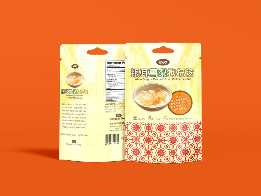
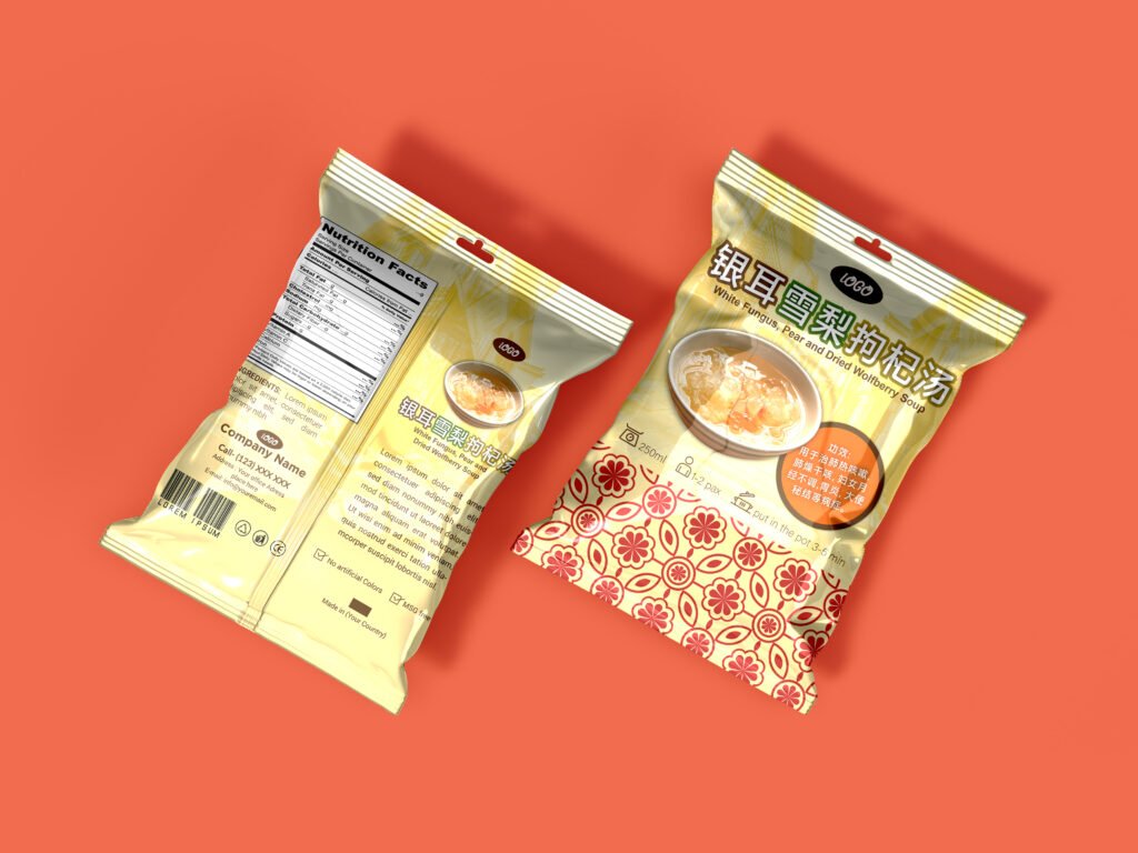
银耳雪梨枸杞汤 | 清新温润风格
设计概念:
采用柔和的黄色和橙色调,搭配传统图案和小碗插图,营造出温润养生的氛围。整体风格清新明亮,适合强调健康、美容及家庭饮用的甜品包装。
Design Concept:
Featuring soft yellow and orange hues with traditional patterns and an illustrative bowl of dessert, this design conveys a gentle and nourishing feel. The clean and cheerful style is perfect for health-conscious and family-friendly dessert soups.