Brand Design Concept | 品牌设计理念
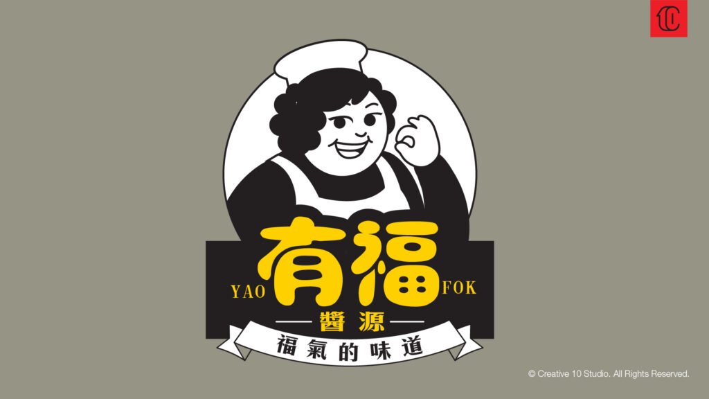
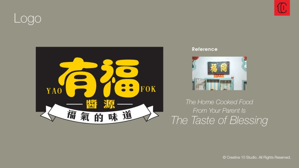
We drew inspiration from the traditional door signboard concept, symbolizing the warmth of home and a sense of belonging. For us, Yao Fok Sauce is more than just a condiment — it’s a taste of familiarity and comfort. The logotype “Yao Fok” is specially crafted with round, chubby strokes to evoke a feeling of friendliness and good fortune — what we call a “blessed plumpness.” To reflect the sauce’s liquid nature, the letterforms are designed to flow smoothly like water, giving the identity a soft and fluid aesthetic. The gold-painted signboard style adds a traditional touch of auspiciousness and prosperity, infusing the brand with positive energy and good vibes.
我们采用「姓氏门上招牌」的概念,象征家的温度与人情味,让「有福酱源」不仅是一瓶酱料,更是一份熟悉与归属感。
主标志中的「有福」字体特别设计为带有“福胖感”的圆润字形,传达亲切、友好的氛围。
同时,为呼应酱料本身的液体特性,字体线条如水流般自然圆滑,带出品牌独有的柔和感与流动感。
金漆质感的招牌风格,也代表了传统中的「好意头」与「开张大吉」,为品牌注入祝福与旺气。
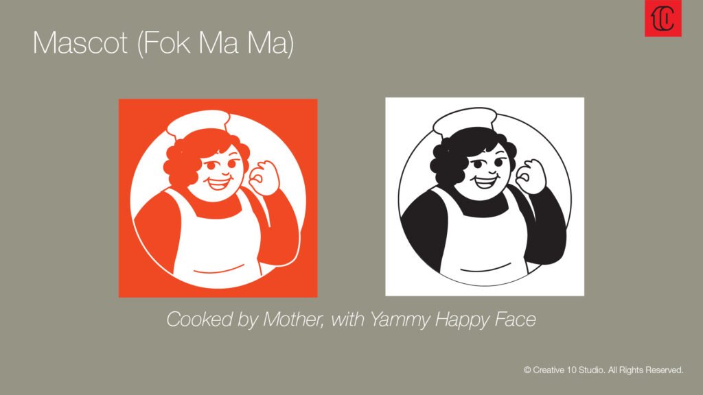
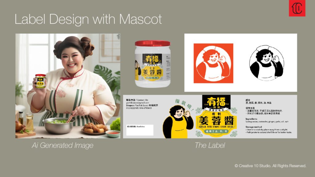
Brand Mascot Design | 吉祥物设计理念
We created a friendly and joyful mascot for Yao Fok Sauce — a smiling, chubby auntie who represents the warmth of a home kitchen. Wearing an apron and chef’s hat, she makes the signature “OK” gesture, showing confidence in taste and quality. Her happy expression reflects the heart of “Yao Fok” — not just great flavor, but the blessing of simple, heartwarming moments. Her bold, rounded form and vibrant color blocks make her instantly memorable, blending nostalgic charm with a modern twist.
我们为「有福酱源」打造了一位亲切可爱的胖阿姨吉祥物,象征家的温暖与熟悉。她身穿围裙、头戴厨帽,招牌OK手势代表对美味的信心与保证。圆润造型与高对比色块,让她在传统与现代之间取得平衡,传达「有福」的幸福感。
Final Label Design | 最終標籤設計