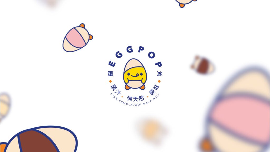
Under the scorching Malacca sun, ice desserts are always the go-to choice for teenagers seeking a refreshing treat. Among the many options, Egg Pop stands out by offering a vibrant selection of naturally flavored ice desserts made from real fruits. Each flavor not only delivers a unique and delightful taste, but also features its own distinctive color, from the bright yellow of mango to the deep red of strawberry, or the refreshing green of honeydew.
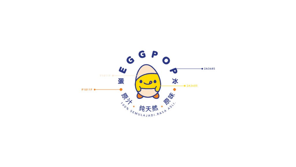
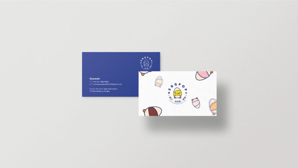
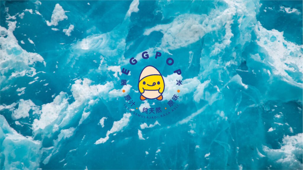
To strengthen the connection with our customers and create a more memorable brand presence, we’ve decided to introduce an adorable character to represent the Egg Pop brand. This mascot embodies the fun, freshness, and playful spirit of Egg Pop. Inspired by the colorful variety of our ice dessert flavors, we’ve extended the color palette into the character’s design, making it visually engaging and instantly recognizable. This vibrant identity helps reinforce brand recognition while reflecting the cheerful and refreshing experience Egg Pop brings with every bite.
为了加强与顾客之间的连结,并建立更鲜明的品牌形象,决定为 Egg Pop 打造一个可爱的品牌角色。这个吉祥物代表了 Egg Pop 的趣味、清新与活力精神。也从冰品多样的风味与颜色中汲取灵感,将这些色彩延伸应用到角色设计中,使其视觉上更具吸引力与辨识度。这缤纷亮眼的品牌形象,不仅提升了品牌识别度,也完美诠释了 Egg Pop 所带来的欢乐与清爽体验。
在炎热的马六甲阳光下,冰品始终是青少年们最爱的消暑选择。在众多冰品中,Egg Pop 脱颖而出,提供多款以新鲜水果制成的天然风味冰品,色彩缤纷、口感丰富。每一种口味不仅带来独特而美味的体验,也拥有属于自己的代表色,从芒果的明亮黄、草莓的深红,到哈密瓜的清新绿,每一款都令人眼前一亮。